Friday, December 14, 2012

Tutorial: Chainmail pattern

In this tutorial I'll explain how I made the chainmail pattern from my most recent piece which should be right below this tutorial.

1. First make a document at 500x500 pixels and 300 ppi

2. Fill the document with a neutral grey. You can do this by using this keystroke [SHIFT + COMMAND/CONTROL + 4] and choosing 50% grey. You can also make whatever grey you want using the Paint Bucket tool.


3. After filling the canvas, use a Stained Glass filter to make the initial texture using the setting I have listed.


4. Finally copy the current layer, set the copy to 50% opacity, and use the Move Tool [V] and arrow keys to move the copy up every so slightly.


5. You're done! now just export as pattern and the chainmail will appear in menu when ever you wan to insert a pattern.


Thursday, December 13, 2012

Finished! (almost)


Here's the sort-of finished bust of Dr. Freeman. I've spent lots of time only on this part which I hope to finish sometime....maybe. There were some parts where I experimented with the mixer brush which gave a dramatically softer tone than the rest of my painting.

Saturday, December 8, 2012

Progress!


Freeman's head is coming along! Still need to shade his cheeks and forehead and add light to the hair. I'm going to add texture and rough it up a little once everything is painted.

Friday, December 7, 2012

Painting: Gordon Freeman


This is the stating of the sketch of the Half Life main protagonist, Gordon Freeman.
Since this game is from around 1998, the Hazard Suit he wear has block geometry making it perfect for practicing my straight line drawing while also practicing curves. I hope to have this done within a week.

Friday, November 30, 2012

Surrealism (Unfinished)


    This piece still needs a lot of work including activating the areas left empty and fixing the shadows of  the statue. Additionally, I plan to tone down the lowlights and shadows, add tracks for the elephants, and impose a graphic, such as a compass, in the sky.

Friday, November 16, 2012

TOO MANY GIFS

This has been a site I've been working on for a awhile now called TOO MANY GIFS. As a site comprised entirely of gifs, I made this site using HTML, CSS, and PHP. It features a full contact page with a Thanks page and confirmation email.
Enjoy.
http://cspe.shorecrest.org/scorpion/TOO_MANY_GIFS/index.php


Monday, November 5, 2012

JavaScript!

     I now feel I have a firm grasp on HTML and CSS so I'm now looking into learning the basics of JavaScript in order to better animate my websites and polish them further. Although I realize I've only scratched the surface of both HTML and CSS, my plan is to go further into web design knowing the fundamentals of HTML, CSS, PHP, JavaScript, and maybe even Jquery. Luckily, JavaScript is a lot like an objective based language which should make it an easy learn coming from a C/C++ background.

Friday, November 2, 2012

HTML
tutorial

This week I began working on learning a new function tag in HTML called the <details> tag. This tag enables you to condense and hide information and then restore it by pressing the small arrow by the tag's name. I can already see how this can be useful in making FAQ type tages and displaying all key points within view without the need to scroll.
 tutorial link: http://net.tutsplus.com/tutorials/html-css-techniques/quick-tip-the-awesome-details-element/

Friday, October 26, 2012

First Full Sized Web Page


    This week, I designed my first full sized web page which I made for my Art and Photography.
Most of the tabs aren't fully functional yet but for the Gallery tab, I plan to make a tasteful interface for viewing photos instead of just scrolling down. This page uses 5 different html files all sharing the same CSS style sheet. Everything on here was completely from scratch with everything made in either Photoshop and Dreamweaver.

Wednesday, October 17, 2012

A WEB PAGE THAT FINALLY WORKS :D


So I finally got my webpage to start working. I've been trying to get used to Dreamweaver and Fireworks for web development and the time was ver well worth it. The background of this page was made in Fireworks while the CSS and HTML was added in Dreamweaver, which works wonders on quickly adding CSS rules.

Wednesday, October 10, 2012

Using Blender

    I recently took up Blender in my leisure time which is a free, open source, 3D rendering software. I tried this sort of software before using 3DS Max but I found it to be very overwhelming and clunky to work with (although I assume the UI is easy to work with once you know what you're doing). Anyways, this was the first render I made through messing around with Blender and working with material and textures. In the future, I hope to add a caustic for the diamond as to make it more "shadow" realistic.

Wednesday, October 3, 2012

Deadly Cute


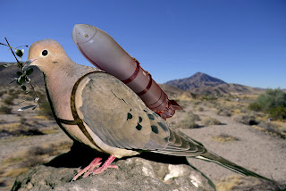
    For this project, we were told to make a piece of a cute animal with lethal or scary qualities. For mine, I took a dove and strapped a bomb to its back with an olive branch in its mouth. What I try to convey through this piece is the hypocrisy and two-faced nature of our current government. We continue to wage a fruitless war which in turn, drains our resources, raises our taxes, and ends the lives of good American soldiers. Yet, we continue to proclaim how peaceful we are. In our current state, perhaps only war can bring peace, but I stand in opposition to that.   

Thursday, September 27, 2012

Tides.shorecrest.org Button (Image coming soon)

So far this week, I've been working on a button for the Shorecrest for Tides. Mr. Seymour recruited me to work on it and after carefully  viewing and observing the Tides website, I came up with a color scheme, a rather stark one at that. The wave came from a suggestion of Mr. Runge's with turned out very well. I hope Mr. Seymour likes my work and I'm excited to see my work on the front page of shorecrest.org.
Thanks again Mr. Seymour!

Thursday, September 20, 2012

Starting with HTML and CSS


 This year, I'll be focusing a lot on HTML and CSS in order to learn the basics of website construction and engineering. Luckily, CSS, in my opinion, is loosely based on C so the learning curve isn't too bad. HTML, on the other hand, seems to be its own markup language but rather easy to learn and much more intuitive than some other languages I know. Anyways, this is a screen shot of the website I've made so far using a tutorial. I'll link the tutorial below since it's very well put together and easy to follow.
http://www.youtube.com/watch?v=H3KESBQTD8k

Wednesday, September 12, 2012

Radial Blur


I've recently been messing around with the Radial Blur filter and have come up with some interesting results. By placing lines along an X and Y axis set up (perpendicular to the axes) and then using a radial blur filter, I came to this result. Lastly, I duplicated the layer and added a motion blur to give the subtle diagonal lines drawing from the upper left, to the lower right. No outside images were used in the making. Image is 1600x900 at 300ppi.

Thursday, September 6, 2012

Surrealism: Devil to Pay


   This past week, the project to make was on Surrealism. Upon going over idea after idea in my mind, finding something, starting it, then scratching it a few days later, I conjured this idea. To many, this piece would appear excessively sanguinary although I find all the gore to be necessary for the meaning it holds. The focus of this image, a serpent erupting from someone's arm symbolizes how, inside us all, holds a small amount of evil. The serpent representing Satan, hence the title, Devil to Pay. Furthermore, the size of the snake holds a deal of importance in how it tears a large, painful lesion. Sometimes we must expel evil and terror invasively, which, through this piece, I try to convey holds to be extremely painful and scarring; and yet,  the pain would be just as equal to withhold such hatred inside.

Friday, August 31, 2012

Vector Desktop Background (1600x900)


   This post was originally supposed to be my current project, however, I wanted to wait for the piece to be done and presentation-worthy before I put it up to the world. Anyways, I made this background just this evening using Illustrator for the lines and Photoshop for glow effects. All the glows are layer styles so the color and intensity are completely editable. This year I really want to focus on non-destructive editing, a skill that would have saved me a lot of time last school year. The piece is in a 16:9 aspect ratio so it should display nicely on most modern monitors.
Enjoy!

Thursday, May 10, 2012

Out of Place Eagle

The goal of this project was to design a piece where an eagle wouldn't be found in nature. Most of my work was done just this night and I've been working on other software and familiarizing myself with cg. Never the less, I wanted this to be one of my better pieces. I included many small details like the eagles in the background, the triple eye, and the selective color to give the piece more to look out without being overpowering.

Thursday, May 3, 2012

Selective Color

This is an easy piece I made by using a technique to achieve selective color. Most people always make the background desaturated while keeping the subject saturated. I wanted to go out of the box by making the subject desaturated forcing the eye to be drawn to the out of focus background which draws the eye back towards the desatuated flowers.  Some choose to go about this using Color Range, Fuzziness, Range, Etc. but this way is far easier. The only adjustment you need a Hue/Saturation Adjustment Layer with a Layer mask of the area. The layer mask can be achieved by using the Quick Selection Tool while painting over the missed parts with the brush tool. This creates much better results than other methods. Although, the desaturation wasn't the only adjustment I made. I also added a Curves Layer in order to correct the background color along with a layer technique involving setting one white and one black layer on certain blending modes in order to increase shadows and highlights.

Tuesday, April 24, 2012

PS Actions

This piece was made from a normal picture of mushrooms which I then darkened the corners using an action I made. Then, I added a orangey-yellow layer that I then lowered the opacity on to give a sepia effect. Lastly, I added some noise and slight blur to the photo to make it look lomographic.

Thursday, April 19, 2012

Easy Stainless Steel Background Tutorial

While working on a piece in photoshop, I stumbled a across an easy, and quick way to create a stainless steel background. In this tutorial, I'll show you my method.

1. Make a document about 50 pixels greater than your intended width for your document. Make the hight your intended hight. If you are using the image for web, 72 ppx is fine; for print, 300 works best.

2. Choose a light grey for your foundation of your background. If you feel the grey is too dark or too light, don't worry we'll fix it later.

3. Add some noise to your image to give us something to work with in making the background. I recommend the setting I used below.


4. To make the "grain" of the stainless steel, we are going to add a motion blur to the image. 


5. You'll notice that the left and right sides or your image are a little frayed. To fix this, go under Image ---> Canvas Size and adjust the width down to the intended size of your background. This is why we added the extra 50 pixels.

You could stop here but to add some variation to the background, add the noise and motion blur again using slightly different setting to get a better result. Also, if your image was too dark/light, add a Brightness and Contrast layer and play with the brightness slider until you're happy.

Final Result:

Enjoy.

Monday, April 9, 2012

Color Replacement Tool

Using the color replacement tool, I was able to take this flower and replace it with a designated foreground color without producing a choppy or blocky result. Normally, I would just use a Hue and Saturation set to Colorize with a layer mask but this method is far quicker.

Friday, April 6, 2012

Adobe Illustrator: Twirl Tool

   Lately, I've been trying out the features of Adobe Illustrator and what it has to offer. Illustrator is a vector based program in which graphics are made. Photoshop has limited vector capabilities such as shapes but Illustrator picks up where Photoshop left off. So far, I've mainly been using the twirl tool. I made this piece using the tool then imported the vector into Photoshop to make this 1600x900 background. 

Thursday, March 29, 2012

3 Favorite Pieces


These are my 3 favorite pieces I've done.
Top: Disturbed Tranquility
Middle: Beast Born
Bottom: Prooster

Make Yourself Do Something Amazing

For this project, we were asked to put ourselves in an amazing context. I chose a picture of the president giving a speech but the picture was a scan of a film print. There a good amount of film grain in the image so I decided to use that noise to my advantage. I started by adding some more film grain and burn holes in the photo to make it appear old and weathered. Finally, I added a grunge layer on top of the image to add to the overall effect. These techniques also helped me to integrate my face better in the image.

Friday, March 23, 2012

Quick Linen Background Tutorial

Im this tutorial, I'll be showing you how you can create a clean linen background for your Photoshop projects with a few simple steps.

1. First, you want to create a PS document about 15 pixels larger than the display you are intending to use this background on. We will be cropping later.

2. Once you have your document, use the keystroke COMMAND/CONTROL + U to bring up the hue and saturation menu. Reduce the lightness bar to get the shade of grey you want.


3. Now, head into Filters ---> Sketch ---> Water Paper and use the settings I have.


4. At this point, you'll notice that the edges are not uniform to the rest of the image. Reduce your canvas  size by heading under Image ---> canvas size and reduce the size to the resolution of your display. This should fix the problem.

5. Final result.


Thursday, March 22, 2012

Wax Seal Tutorial

Here is my work I did from a tutorial made by IceFlowStudios on how to make a wax seal in Photoshop. I made the letter on my own as context with a texture made by ~Essence of a Dream~ on Flickr.


Wax Seal Tutorial: http://iceflowstudios.com/2012/tutorials/photoshop-wax-seal/
Dirty Texture: http://www.flickr.com/photos/30886604@N04/2905276304/

Tuesday, March 20, 2012

Amazing Fantasy Planet Tutorial

I made this desktop background using a helpful and quick tutorial made by IceFlowStudios on Youtube. He creates some amazing pieces and tutorials and definitely deserves a look. Link below.
http://www.youtube.com/watch?v=xno0yCTURmY

The First Piece for The First Post

This was the first piece I had created for my graphics class. It was made for an in-class project dealing with a furry selection, like the lion's head. A few months later, I submitted the piece to the Scholastic Art Awards and as a pleasant surprise, Beast Born won a Gold Key along with one other piece.