Wednesday, January 30, 2013

Quick Tutorial: Exposure and Exposure Offset

Perhaps on the the unsung heroes of the Adjustment Layers is the Exposure Layer. Most people will just default to Brightness and Contrast or Curves layer which can be cumbersome to work with especially when trying to accomplish one outlook with two layers. The Exposure layer does it in one.
Below are a couple images of the UI for Exposure:


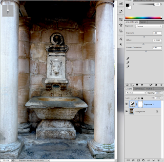
Now lets begin editing out image. The process is fairly painless. However, notice that the "Offset", which I consider to be the "gem" of this layer, has 4 significant figures after the decimal. This is because we only use a VERY little amount of this, it's quite potent. Here is our image before Offset:

And after:

2. Now using the Gamma Correction slider, lets fix some of those colors:
3. And you're Done! Play around with these effects more, it's one of the mist powerful layers in photoshop and can increase depth quickly, cleanly, and consistently.  Here's a picture of what can happen if you drag the slider to the left, to increase high lights, which on this image, make it look too washed out, so beware of the power of this tool.


Tuesday, January 29, 2013

2 Combined Images


This was a rather fun piece to make. Everything within the white area was created by me while the rest of the image is generally vanilla, apart from some minor touchups I made. I started my making a sketched outline of the building and then modifying that sketch with the pen tool. For the rocket, I sketched an outline of that as well which I then masked to fit the cracks and holes of the cathedral. The rubble was some of the most fun part to make, however. Using the pen tool, each piece was made in place and given heavy shadows. I tried shading the pieces but it detracted from the minimalist art style of which I'm a fan.

Thursday, January 24, 2013

Colors


From top to bottom: Lighted, Sad, Vibrant, and original.

Most of the work I've done to this image was done with photoshop artifacts rather than other images. The rain in the sad image was a custom bush with a motion blur put on the results which gave the impression of falling rain. Furthermore, the light streaks were made with the pen tool and a gaussian blur with a touch of a gradient layer mask in order to greater blur the edges.

Monday, January 21, 2013

Forgot to Blog :/

So I forgot to blog this week so I guess I'll do it now. Anyways, we're starting a new project on the combination of two pictures. Currently, I'm working on combining a warhead and the steeple of a church as if the rocket is launching out of the steeple in a cloud of smoke and fire. I haven't got too far on the project aside from the composition and positioning of the elements I intend to use. Everything still has to be integrated a lot better than it is currently. I'll be posting the final project, hopefully, this Wednesday.

Friday, January 11, 2013

[WIP] Self Portrait [Preview]

 
   Currently, I'm working on a project in which we take the origins of our full name and compose them into a piece represent us. For me, I'm using the center figure as St. Stephen with influences from my other names and motifs surrounding or encompassing him. For example, I'll have Stephen hold a blacksmith's hammer with a weathered anvil behind him. The martyr stones where colored to look like coal, which turned out in my favor.

Thursday, January 3, 2013

Self Porrait

   Back to school with a new project in the works, a self portrait composed of symbolism based off our names. My focus of the piece will, for now, be on St. Stephen surrounded in darkness which derives from my first name Cole which, in Old English, was coel, meaning coal or darkness. I not certain on the format quite yet but I'll work the piece more over the weekend and try to formulate a cleaver outcome.