
Tuesday, December 17, 2013
Final Propoganda
Friday, December 6, 2013
USGS app progress

Thursday, November 21, 2013
Propaganda 3

Friday, November 15, 2013
Tutorial WIP

http://psd.tutsplus.com/tutorials/photo-effects-tutorials/create-a-caricature-from-a-photo/
Friday, November 8, 2013
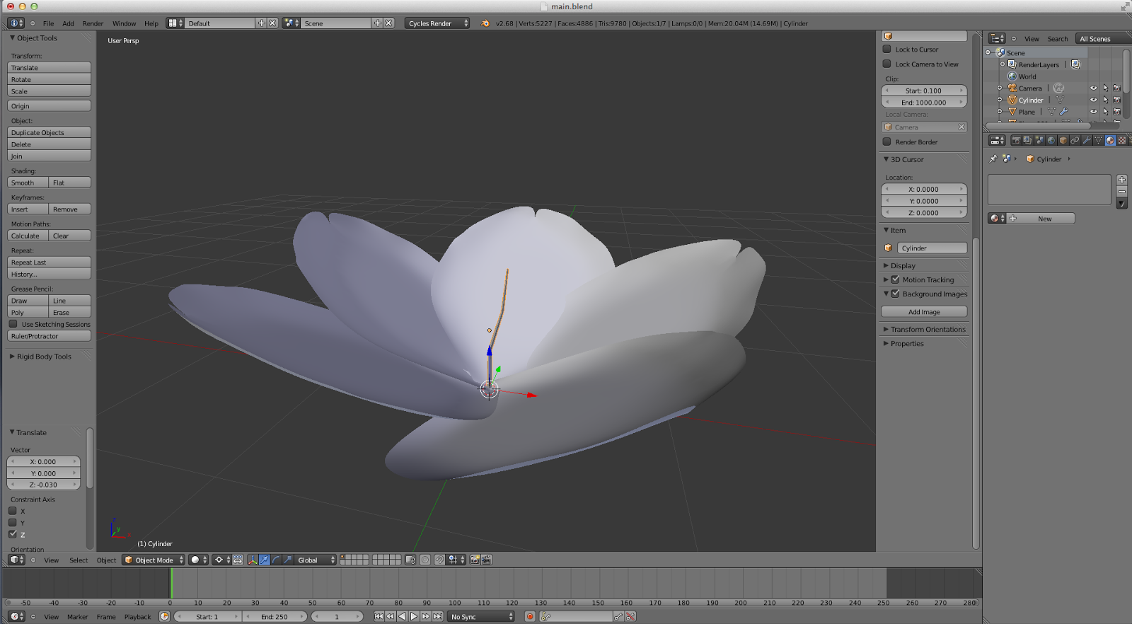
Hanging Garden WOP

This piece (well, piece in progress) was influenced by work which merged the natural world with a cold, industrial, and human one. The synthesis in the original was a hole in the wall merging the two worlds, however, I opted to take my own approach and have the natural world hang in a garden surrounded by the cold and darkness. I haven't completed it just yet; I still have to do the particle system for the leaves and also add the nature in post but I have the general modeling, texturing, and lighting done.
Wednesday, October 30, 2013
Dude that's so Red

I used the provided Chinese propaganda posters for inspiration for this piece. Using the iconic red color of communism, I made a pro-war poster that promotes an autocratic and imperialistic notion. The characters read, "for many lost, so much is gained". The background was made from the main bomb in the foreground by creating a pattern and then applying the pattern to the background.
Wednesday, October 23, 2013
Propoganda Poster

Upon looking up my name, I figured out that, other than its origin, 'cole' is a synonym for wild cabbage. When I was sourcing a cabbage image, one looked particularly like a brain. I rolled with the idea and came to this conclusion. With some layer masking, styling, filters, and font I came to this result.
Tuesday, October 15, 2013
Dali Surrealism Review
Forward: I own NONE of these pieces. All can be found at [ http://www.flickr.com/photos/dali_museum/sets/72157634434072880/page2/ ] These pieces were featured for personal review only
 This piece struck me right away, the overall completeness and polish is suburb. The creative use of transparency gives the viewer a wonderful sense of depth while the colors work in perfect harmony with each other, no one overpowering the other. Overall, this was my favorite work from the 5 pages of artwork.


One can admire this piece for the excellent photo manipulation job. The transition between creature and tongue is nearly seamless and the texture is spot on. Overall wonderful execution and a clever concept.

I'm a sucker for a shallow depth of field and this piece implements DOF beautifully. I also enjoy the warm tones which gives the work a greater impact than the use of cooler and less saturated tones probably would have provided.
Friday, October 11, 2013
Cherry Blossom WOP
I've been following a Cherry Blossom tutorial for my most recent project. Since the composition is fairly simple, I haven't been following the tutorial very strictly since I wanted to take my own approach. There aren't any needed specular, bump, or normal maps , only one UV for the pedal texture. I'll possibly incorporate this flower into other pieces using it in an entire branch of flowers or an execution similar.
Thursday, October 3, 2013
Artist Emulation 2

Friday, September 27, 2013
Valley Analysis

Structurally, I tried to balance the piece by creating a composite along the horizon using the sides of the valley, the bridge and the sun. The sun represents the main focal point and emphasis of the piece. The hanging board is in the position it is for this exact reason. Furthermore, one may say the scale of the sun is disproportionate to the rest of the scene. This too is intentional since its size, from a technical standpoint, evenly lights the scene without giving glaring highlights or lowlights, and a structural standpoint to become the main focus, unify the piece.
As for the developmental devices of the scene, there's a flow of lines pointing back the sun and bridge, where the main content of the piece lies. Moreover, the water reflection draws one's eye back the center of the scene. I worked hard to make the texture as life-like as possible. From a technical perspective, the cliffs are a collection of specular maps, normal maps, bump maps, texture maps, displacement modifiers, and hand sculpting to give a realistic and tangible feel. Fortunately, space is a breeze to composite in a 3D application since objects can be arranged how they would be outside of the computer. Lastly, the color choices came from inspiration and reference images to attempt to make the most realistic scene possible, still keeping a unique and hyperreal conception.
Friday, September 20, 2013
Cliffs

This week, I'm working on a tutorial piece using cliff faces in Blender. The tutorial implements many concepts new to me which in synthesis, produced a beautiful result. This is still a work in progress and I plan on making something entirely different, using the same techniques and materials. I'm using just a plane for now to make perhaps an auxiliary piece or something supplemental for a larger project.
Monday, September 9, 2013
Artist Emulation Piece 1

Tuesday, September 3, 2013
Artist Review: Adam Martinakis

For Adam's piece titled "Roots of Fire", and many of his other works is the synthesis of sharp cutaway lines with the smooth and subtle engraved lines throughout the main focus. I particularly enjoy the material he chose for the "skin". It's a concrete-like material with a wonderful looking bump map and slight gloss and specular. The composition of this piece even follows a gentle curve as does the details.

_1000.jpg)
Somewhat similar to the first piece listed, "Baptized By Fire" conveys a powerful feeling especially since the giant man at the left looks to have inflicted this blaze upon himself. The detail of the vines and the complexity of the background make for a stunning synthesis and adds a certain sense of depth to the scene.

Continuing with the theme of fragmentation, "truEnd" uses a stunning element of motion blur to convey an action of shattering. This is by far the most active and kinetic work of the other 3 listed.

Wednesday, August 28, 2013
5 Artists

Bogdan Zwir: Bogdan Zwir is from Saint Petersburg, Russia and uses photography and photo manipulation as his main medium. Zwir enjoy “the absurd” much in the way that a child’s imagination runs wild, however, Zwir is not a child anyone. His work contains deep hues and powerful messages that conveys physical feelings like pain, love, or bewilderedness.

Alain Mathiot: While I couldn’t find his “about” page on his website, I can infer he’s from a French speaking country and his work contains plenty of oil-on-canvas, inking, and digital art. his variety of mediums is just as numerous as his variety of styles. While some may appear surreal, others may convey a lighter message or something completely of his own.

Mark Powell: Mark Powell lives in the United Kingdom with his main, and almost exclusive, medium being ink on paper. The most striking aspect of all his works is definitely the eyes of the people he draws. They convey a sense of power, experience, or age. None of his works are simple portraits and no detail is left behind.

Apachennov: Eugene Soloviev is from Nizhniy Novgorod and uses photo manipulation to yield surreal and interesting works. His portfolio is expansive and uses plenty of variety from a stark surreal scene, to a busy and emotional one. I’m a big fan of this piece in particular, this artist will probably be one of the artists I write my paper on.

Adam Martinakis: Born in Lubań, Martinakis, is a 3D digital artist with breathtaking taking work and wonderful manipulation of light and raytracing. He follows a similar style juxtaposing a concrete or stone material against a glossy material. He’s had multiple exhibitions and awards. I will definitely be writing my paper on this artist.
Sunday, August 25, 2013
What I did over the summer

Over the summer, I tried to sharpen my 3D graphics skills in prep for the new school year. My goal is to implement more 3D into my pieces making it easier to create what I envision instead of having to scour the internet in search of the perfect photo. I see myself taking a serious path down this journey and I hope to keep up to date in the CG world even when my classroom graphics career ends.
Monday, May 13, 2013
Rainy Window: Finished

Friday, May 10, 2013
Rainy Window WOP

Wednesday, May 1, 2013
Maya Dynamics: Stormy Ocean Simulation

Thursday, April 25, 2013
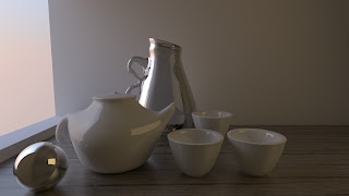
Cycles Tea Scene
Wednesday, April 17, 2013
Drop the Base

Tuesday, April 9, 2013
MY BRAND

Thursday, April 4, 2013
Vexel Image

Saturday, March 30, 2013
GIF Animation (Image Coming Later)
This week, we were to make a gif animation on a political policy of our choosing. I chose to illustrate human trafficking. Unfortunately, the gif is unfinished and not with me at the time so I'll do my best to describe it. Basically, an austere woman is in a darkly lit setting where there is a robotic stamp above her. More copies of the same woman are behind her. Her forehead is embossed with a seal of a locked padlock. The gif loops back again. Without actions, I don't think I could have ever got this done.
Thursday, March 21, 2013
Spring Luncheon Piece 1

This week, our focus was the annual Spring Luncheon. We're supposed to include a Sunflower in honor of Mrs. Wineman who passed away recently. I was quite fortunate to find super high resolution photos for this piece making it perfect for print with next to zero blurriness. There were supposed to be people walking on the Earth, almos giving a miniature impression but I decided against it.
Wednesday, February 27, 2013
Blender Rendered Logo

This week, we were told to create our own fictional company and design two logos for said company. I created cOre: OS which will (hopefully be) a Linux derived operating system designed for ease of use and extremely high faul tolerance. I designed this logo in the Blender environment using the Cycles Redner engine. The polygon work for the logo itself was not the challenge, rather, the lighting presented to be a big obstacle and exporting as a jpeg to be an even larger hurdle.
Wednesday, February 20, 2013
Poster: Revised

I tried to go a different direction than previously intended with this piece. Mainly, I chose to minimize the original work, a choice I now feel I should've not done, and add in other elements in the poster to better support my message. I wanted to go with a cool blue color scheme as the color seemed pleasing to the eye.
Tuesday, February 12, 2013
Olitory

For this piece, we were all assigned a word in which we must make a poster surrounding that word. My word was Olitory which I found was defined as a kitchen garden. As for the composure, I went for a propaganda approach on brainwashing masses into accepting artificial chemicals in food.
Friday, February 8, 2013
Cool Tutorial
I don't have much to post this week but I found a cool tutorial on PSDtuts the other day and I felt like sharing. The tutorial is about making a miniature scene. I was particularly intrigued on the shadows of the animals, especially the cat, which looks absolutely perfect. Unfortunately, the tutorial is a premium one so I wasn't able to view the entire thing besides the selections.
http://psd.tutsplus.com/tutorials/photo-effects-tutorials/miniature-scene/
http://psd.tutsplus.com/tutorials/photo-effects-tutorials/miniature-scene/
Wednesday, January 30, 2013
Quick Tutorial: Exposure and Exposure Offset
Perhaps on the the unsung heroes of the Adjustment Layers is the Exposure Layer. Most people will just default to Brightness and Contrast or Curves layer which can be cumbersome to work with especially when trying to accomplish one outlook with two layers. The Exposure layer does it in one.
Below are a couple images of the UI for Exposure:


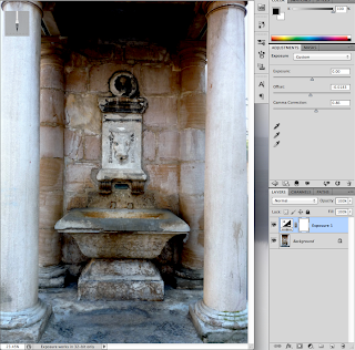

Below are a couple images of the UI for Exposure:

Now lets begin editing out image. The process is fairly painless. However, notice that the "Offset", which I consider to be the "gem" of this layer, has 4 significant figures after the decimal. This is because we only use a VERY little amount of this, it's quite potent. Here is our image before Offset:

And after:

2. Now using the Gamma Correction slider, lets fix some of those colors:

3. And you're Done! Play around with these effects more, it's one of the mist powerful layers in photoshop and can increase depth quickly, cleanly, and consistently. Here's a picture of what can happen if you drag the slider to the left, to increase high lights, which on this image, make it look too washed out, so beware of the power of this tool.

Tuesday, January 29, 2013
2 Combined Images

This was a rather fun piece to make. Everything within the white area was created by me while the rest of the image is generally vanilla, apart from some minor touchups I made. I started my making a sketched outline of the building and then modifying that sketch with the pen tool. For the rocket, I sketched an outline of that as well which I then masked to fit the cracks and holes of the cathedral. The rubble was some of the most fun part to make, however. Using the pen tool, each piece was made in place and given heavy shadows. I tried shading the pieces but it detracted from the minimalist art style of which I'm a fan.
Thursday, January 24, 2013
Colors


From top to bottom: Lighted, Sad, Vibrant, and original.
Most of the work I've done to this image was done with photoshop artifacts rather than other images. The rain in the sad image was a custom bush with a motion blur put on the results which gave the impression of falling rain. Furthermore, the light streaks were made with the pen tool and a gaussian blur with a touch of a gradient layer mask in order to greater blur the edges.
Monday, January 21, 2013
Forgot to Blog :/
So I forgot to blog this week so I guess I'll do it now. Anyways, we're starting a new project on the combination of two pictures. Currently, I'm working on combining a warhead and the steeple of a church as if the rocket is launching out of the steeple in a cloud of smoke and fire. I haven't got too far on the project aside from the composition and positioning of the elements I intend to use. Everything still has to be integrated a lot better than it is currently. I'll be posting the final project, hopefully, this Wednesday.
Friday, January 11, 2013
[WIP] Self Portrait [Preview]

Currently, I'm working on a project in which we take the origins of our full name and compose them into a piece represent us. For me, I'm using the center figure as St. Stephen with influences from my other names and motifs surrounding or encompassing him. For example, I'll have Stephen hold a blacksmith's hammer with a weathered anvil behind him. The martyr stones where colored to look like coal, which turned out in my favor.
Thursday, January 3, 2013
Self Porrait
Back to school with a new project in the works, a self portrait composed of symbolism based off our names. My focus of the piece will, for now, be on St. Stephen surrounded in darkness which derives from my first name Cole which, in Old English, was coel, meaning coal or darkness. I not certain on the format quite yet but I'll work the piece more over the weekend and try to formulate a cleaver outcome.
Subscribe to:
Posts (Atom)