Saturday, March 30, 2013
GIF Animation (Image Coming Later)
This week, we were to make a gif animation on a political policy of our choosing. I chose to illustrate human trafficking. Unfortunately, the gif is unfinished and not with me at the time so I'll do my best to describe it. Basically, an austere woman is in a darkly lit setting where there is a robotic stamp above her. More copies of the same woman are behind her. Her forehead is embossed with a seal of a locked padlock. The gif loops back again. Without actions, I don't think I could have ever got this done.
Thursday, March 21, 2013
Spring Luncheon Piece 1

This week, our focus was the annual Spring Luncheon. We're supposed to include a Sunflower in honor of Mrs. Wineman who passed away recently. I was quite fortunate to find super high resolution photos for this piece making it perfect for print with next to zero blurriness. There were supposed to be people walking on the Earth, almos giving a miniature impression but I decided against it.
Wednesday, February 27, 2013
Blender Rendered Logo

This week, we were told to create our own fictional company and design two logos for said company. I created cOre: OS which will (hopefully be) a Linux derived operating system designed for ease of use and extremely high faul tolerance. I designed this logo in the Blender environment using the Cycles Redner engine. The polygon work for the logo itself was not the challenge, rather, the lighting presented to be a big obstacle and exporting as a jpeg to be an even larger hurdle.
Wednesday, February 20, 2013
Poster: Revised

I tried to go a different direction than previously intended with this piece. Mainly, I chose to minimize the original work, a choice I now feel I should've not done, and add in other elements in the poster to better support my message. I wanted to go with a cool blue color scheme as the color seemed pleasing to the eye.
Tuesday, February 12, 2013
Olitory

For this piece, we were all assigned a word in which we must make a poster surrounding that word. My word was Olitory which I found was defined as a kitchen garden. As for the composure, I went for a propaganda approach on brainwashing masses into accepting artificial chemicals in food.
Friday, February 8, 2013
Cool Tutorial
I don't have much to post this week but I found a cool tutorial on PSDtuts the other day and I felt like sharing. The tutorial is about making a miniature scene. I was particularly intrigued on the shadows of the animals, especially the cat, which looks absolutely perfect. Unfortunately, the tutorial is a premium one so I wasn't able to view the entire thing besides the selections.
http://psd.tutsplus.com/tutorials/photo-effects-tutorials/miniature-scene/
http://psd.tutsplus.com/tutorials/photo-effects-tutorials/miniature-scene/
Wednesday, January 30, 2013
Quick Tutorial: Exposure and Exposure Offset
Perhaps on the the unsung heroes of the Adjustment Layers is the Exposure Layer. Most people will just default to Brightness and Contrast or Curves layer which can be cumbersome to work with especially when trying to accomplish one outlook with two layers. The Exposure layer does it in one.
Below are a couple images of the UI for Exposure:


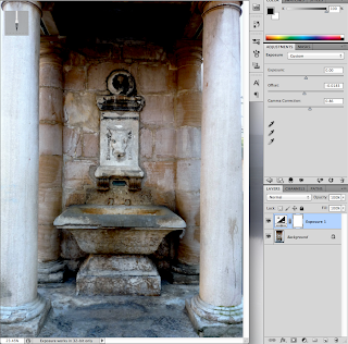

Below are a couple images of the UI for Exposure:

Now lets begin editing out image. The process is fairly painless. However, notice that the "Offset", which I consider to be the "gem" of this layer, has 4 significant figures after the decimal. This is because we only use a VERY little amount of this, it's quite potent. Here is our image before Offset:

And after:

2. Now using the Gamma Correction slider, lets fix some of those colors:

3. And you're Done! Play around with these effects more, it's one of the mist powerful layers in photoshop and can increase depth quickly, cleanly, and consistently. Here's a picture of what can happen if you drag the slider to the left, to increase high lights, which on this image, make it look too washed out, so beware of the power of this tool.

Subscribe to:
Posts (Atom)