
Thursday, November 21, 2013
Propaganda 3
Friday, November 15, 2013
Tutorial WIP

http://psd.tutsplus.com/tutorials/photo-effects-tutorials/create-a-caricature-from-a-photo/
Friday, November 8, 2013
Hanging Garden WOP

This piece (well, piece in progress) was influenced by work which merged the natural world with a cold, industrial, and human one. The synthesis in the original was a hole in the wall merging the two worlds, however, I opted to take my own approach and have the natural world hang in a garden surrounded by the cold and darkness. I haven't completed it just yet; I still have to do the particle system for the leaves and also add the nature in post but I have the general modeling, texturing, and lighting done.
Wednesday, October 30, 2013
Dude that's so Red

I used the provided Chinese propaganda posters for inspiration for this piece. Using the iconic red color of communism, I made a pro-war poster that promotes an autocratic and imperialistic notion. The characters read, "for many lost, so much is gained". The background was made from the main bomb in the foreground by creating a pattern and then applying the pattern to the background.
Wednesday, October 23, 2013
Propoganda Poster

Upon looking up my name, I figured out that, other than its origin, 'cole' is a synonym for wild cabbage. When I was sourcing a cabbage image, one looked particularly like a brain. I rolled with the idea and came to this conclusion. With some layer masking, styling, filters, and font I came to this result.
Tuesday, October 15, 2013
Dali Surrealism Review
Forward: I own NONE of these pieces. All can be found at [ http://www.flickr.com/photos/dali_museum/sets/72157634434072880/page2/ ] These pieces were featured for personal review only
 This piece struck me right away, the overall completeness and polish is suburb. The creative use of transparency gives the viewer a wonderful sense of depth while the colors work in perfect harmony with each other, no one overpowering the other. Overall, this was my favorite work from the 5 pages of artwork.


One can admire this piece for the excellent photo manipulation job. The transition between creature and tongue is nearly seamless and the texture is spot on. Overall wonderful execution and a clever concept.

I'm a sucker for a shallow depth of field and this piece implements DOF beautifully. I also enjoy the warm tones which gives the work a greater impact than the use of cooler and less saturated tones probably would have provided.
Friday, October 11, 2013
Cherry Blossom WOP
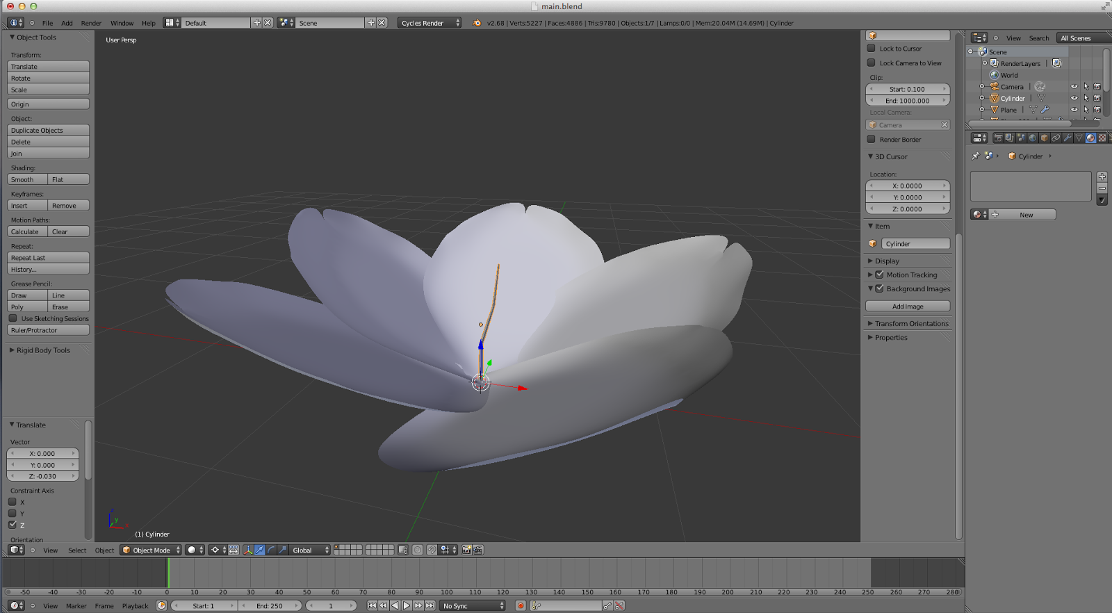
I've been following a Cherry Blossom tutorial for my most recent project. Since the composition is fairly simple, I haven't been following the tutorial very strictly since I wanted to take my own approach. There aren't any needed specular, bump, or normal maps , only one UV for the pedal texture. I'll possibly incorporate this flower into other pieces using it in an entire branch of flowers or an execution similar.
Subscribe to:
Posts (Atom)